


American Angler Cover Call
Blog › Forums › Photography › American Angler Cover Call
- This topic has 110 replies, 33 voices, and was last updated May 8, 2009 at 9:11 pm by
 Mike McKeown.
-
AuthorPosts
-
Nov 15, 2008 at 12:36 am #67512
lee church
MemberHey since I’m here I’ll take a crack at it. Do you have deadline Mr. Monahan?
Thank you,
Lee Church
1
2
3
4
5
 Nov 17, 2008 at 2:58 am #67513
matt boutet
MemberMight as well throw my hat in the ring as well.

 Nov 17, 2008 at 5:23 am #67514
 Mike McKeownMember
This thread could also go in the tutorial section, I have learnt soo much from Phils comments…
Nov 17, 2008 at 12:38 pm #67515Mike Anderson
MemberHorizon is off but it could be fixed.
 Nov 17, 2008 at 1:50 pm #67516
Mike L.
Member Nov 17, 2008 at 1:51 pm #67517
 John BennettMember
Did actually find a couple photos taken during winter of a friend Spey fishing.
 Nov 17, 2008 at 2:51 pm #67518Member
 Nov 17, 2008 at 9:51 pm #67519
wes hendrix
MemberHere’s my go:
23 Degrees…


85 Degrees…

Thanks,
Wes
Nov 18, 2008 at 10:21 pm #67520Phil Monahan
MemberLee #1: Image is too tall, plus there’s no fly rod, which is a problem.
Lee #2: Poor, poor fishy. As a catch-and-release-promoting magazine, we have to be careful that the fish we show on the cover look happy and reay to go back in the water. Plus, the central focus in the frame is too high.
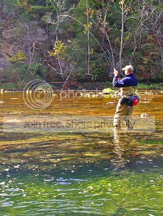
Lee #3: As with a lot of these, it shows an angler’s BACK, when the front is so much more compelling. I like the image a lot, though.
Lee #4: Not a very attractive fish, being squeezed pretty hard. Plus the way the fish’s mouth and net intersect isn’t very contrasty (to coin a word).
Lee #5: Light is too hot, image fills too much of the frame.
Matt#1: Nice image, but the center of the frame is kind of a void. On a cover, this would look like a black hole.
Matt #2: Nice shot, but again, showing the back of an angler. It doesn’t draw the viewer IN to see a figure from behind.
Mike A #1: Pretty, but way too dark with not enough contrast.
Mike #1: A little gauzy for my taste. And from behind. And pretty static.
John #1: I kinda like this one. Unfortunately, that person in the red is so distracting, you look right past the two figures in the foreground. (Or at least I do.) The shot would work better as a cover if the guy on the left weren’t turned quite so far away from the camera.
Mike #2: Not the kind of image that’s gonna cause a guy to cross a room for a closer look.
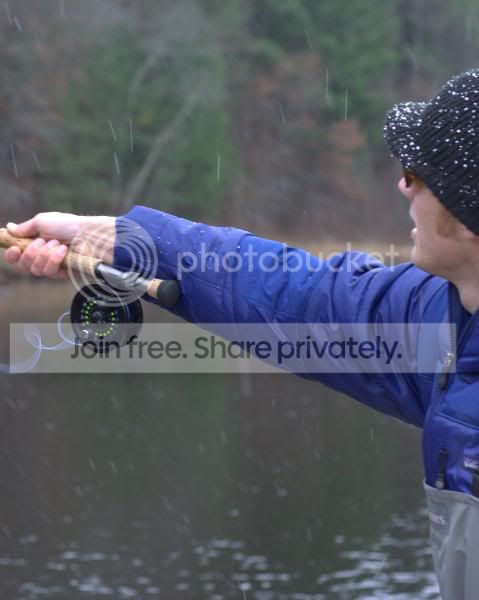
Wes #1: Very cool lighting, but I’m not sure that that’s proper casting technique. ;D Plus the figure is too dark.
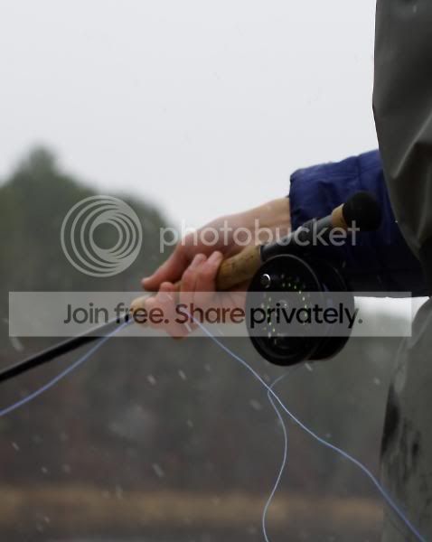
Wes #2 and #3: Too dark and from behind.
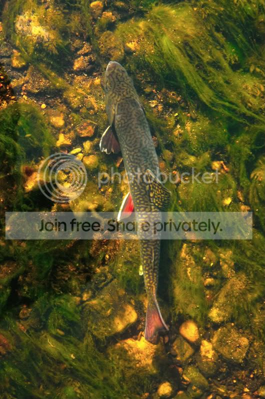
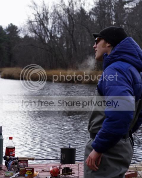
Wes #4: Very cool. Not a cover, though. What kind of fish is that?
Nov 19, 2008 at 1:12 am #67521j.kwasney
MemberWell there’s plenty of winter fishing opprotunities here in east tn, just not alot of snow and wintry scenery…and I’m sure I know the response on most of these, but its still worth the price of admission to get critique from anyone in the business…if anything, this all prompts me to carry the camera around more and learn how to tweak stuff in photoshop…by the way, and I might of missed it – whats the aspect ratio on the cover? Thanks for any input…

 Nov 19, 2008 at 4:47 am #67522Member
Phil,
Thanks for taking a look and providing input. I really appreciate it.
That last shot is a Ladyfish, landed off the rocks behind Spielberg’s house in Naples, Florida. I had no idea they flew like that.
Wes
Nov 19, 2008 at 6:15 am #67525Mike McKeownMember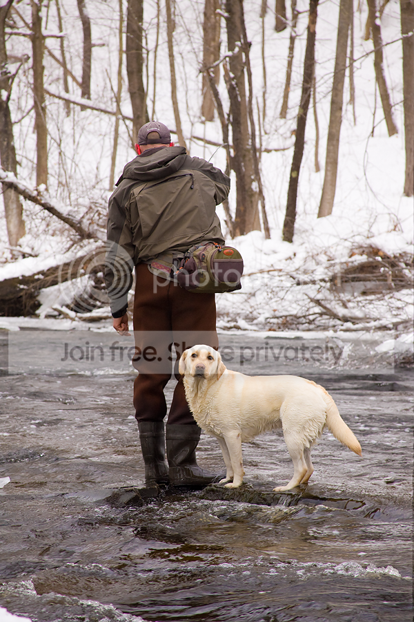
I doubt there’s even enough room at the top for the title, but what the heck. . .
I know Phil will add his comments, but I would walk across a busy street to take a closer look at this one… stunning photo…
Nov 19, 2008 at 3:34 pm #67528MemberJ.Kwasney #1: (I dunno the aspect ratio; standard, I guess) This pic has nothing to grab the viewer.
J.Kwasney #2: The fish comes in at a bad angle for a cover, plus it looks as if it’s screaming “Ouch!”
J.Kwasney #3: Cool shot, but focus is soft (perhaps because of the water). Plus, it just isn’t “grabby” enough.
J.Kwasney #4: ditto above, plus fish is too high in frame.
J.Kwasney #5: Nice shot, but that front lighting is super hot, the angler is too high in the frame, and there are so many competing colors and textures in the shot that it confuses the eye a bit.
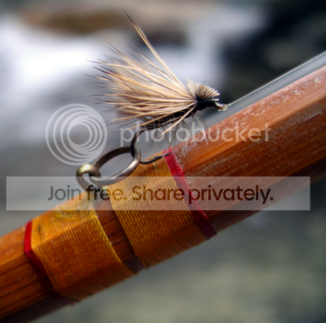
J.Kwasney #6: No fly shots on AA.
J.Kwasney #7: Horizontal
J.Kwasney #8: too abstractBill Blake #1: Great shot! Do you have more from this series? It wouldn’t work for this cover, but I’d consider it the future. Of course, we’d have to flop it, which might create some problems. The big problem with this is=mage is that it’s not tight enough on the figures.
Bill Blake #2: Great shot, but angler is from behind.
Bill Blake #3: Very nice. I wouldn’t mind seeing that in hi-res, although I suspect a lot of work would have to be done on the lighting. Angler looks very dark.NEW RULES: I won’t bother to comment on images that are obviously not appropriate, the right shape, etc. Please read through the thread to learn what I’m talking about.
Thanks to all for the submissions.
Phil
Nov 19, 2008 at 5:23 pm #67529Eric DeWitt
MemberHere’s one i can throw in the mix, if its not to late. I’ve got some more from this series on the computer at home.
 Nov 19, 2008 at 7:12 pm #67530
Zach Matthews
The Itinerant AnglerI like that Eric.
Zach
Nov 19, 2008 at 7:47 pm #67531MemberThanks Zach – hopefully your not the only one.
Nov 19, 2008 at 8:41 pm #67533MemberEric’s is a cool shot, but I think it’s a little too abstract. You have to look at it for a couple seconds before it makes sense. Plus, so little is actually in focus, it’s tough to work around.
Bill, I still think that’s a great shot, but now that I see it big, I’m not so sure it’s a cover. The angler is, as you put it, the weak spot. Plus the background is very busy.
Nov 20, 2008 at 1:24 am #67535MemberThanks for the feedback Mr. Monahan.
Here are some pix of Timmy Pommer that were shot this past wkend.
1.
2.
3.
Thanks again
LeeNov 20, 2008 at 1:18 pm #67536MemberLee:
#1: too tall
#2: the middle of the frame is empty
#3: too dark and staticNov 20, 2008 at 1:21 pm #67537MemberBy this point, it should be clear just how hard it is to find good cover photography, and this is why magazines so often fall back on the same old g-n-g format. We’re out of time on this cover call, so thanks to all who participated. I’ll let you know what we ultimately come up with.
Should any of you, whether through design or dumb luck, shoot something that you think would work on a cover (keeping in mind all my objections to images in this thread) please don’t hesitate to send it to me.
Phil
-
AuthorPosts
- You must be logged in to reply to this topic.