






Aaron’s Bass Photoshop Fix
Blog › Forums › Photography › Aaron’s Bass Photoshop Fix
- This topic has 19 replies, 7 voices, and was last updated Jul 7, 2008 at 9:52 pm by
Aaron Otto.
-
AuthorPosts
-
Jul 3, 2008 at 11:04 pm #7615
Zach Matthews
The Itinerant AnglerHey guys –
Aaron asked me to show how I would add color to his bass shot. Here we go.
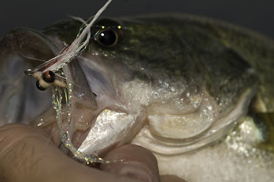
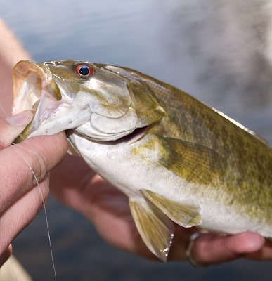
Here’s Aaron’s shot:
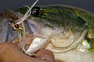
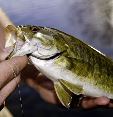
Here’s my rebuild:
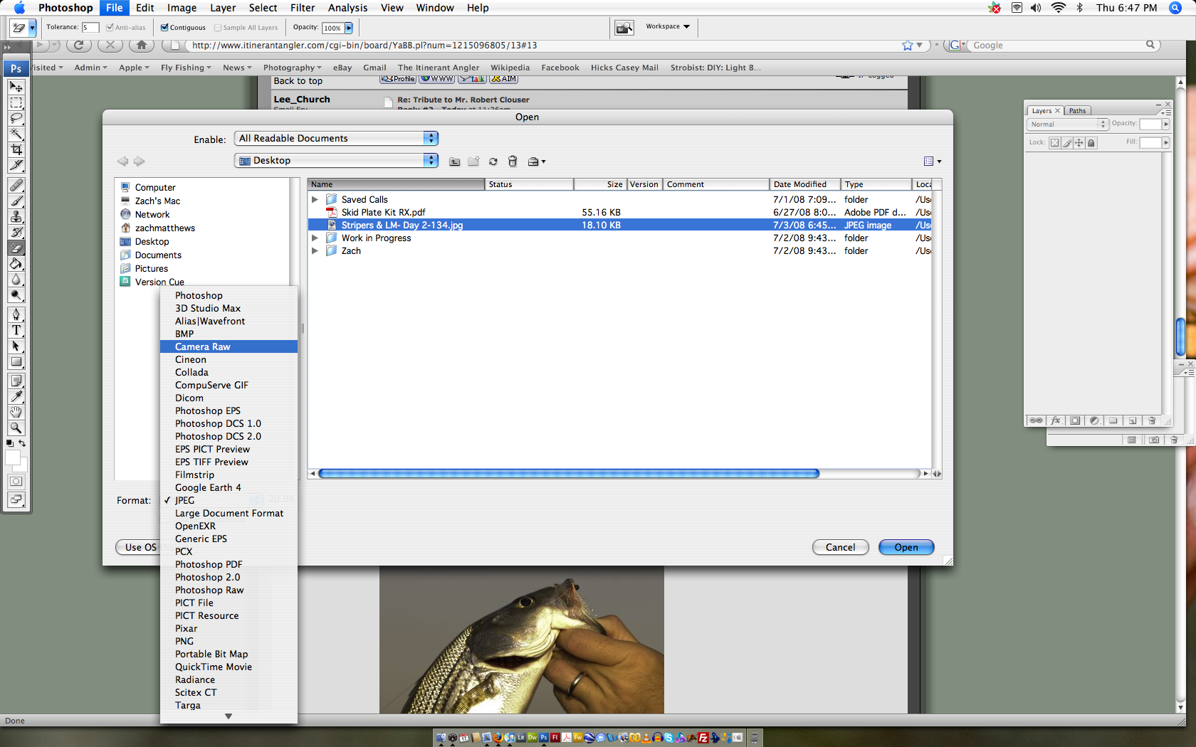
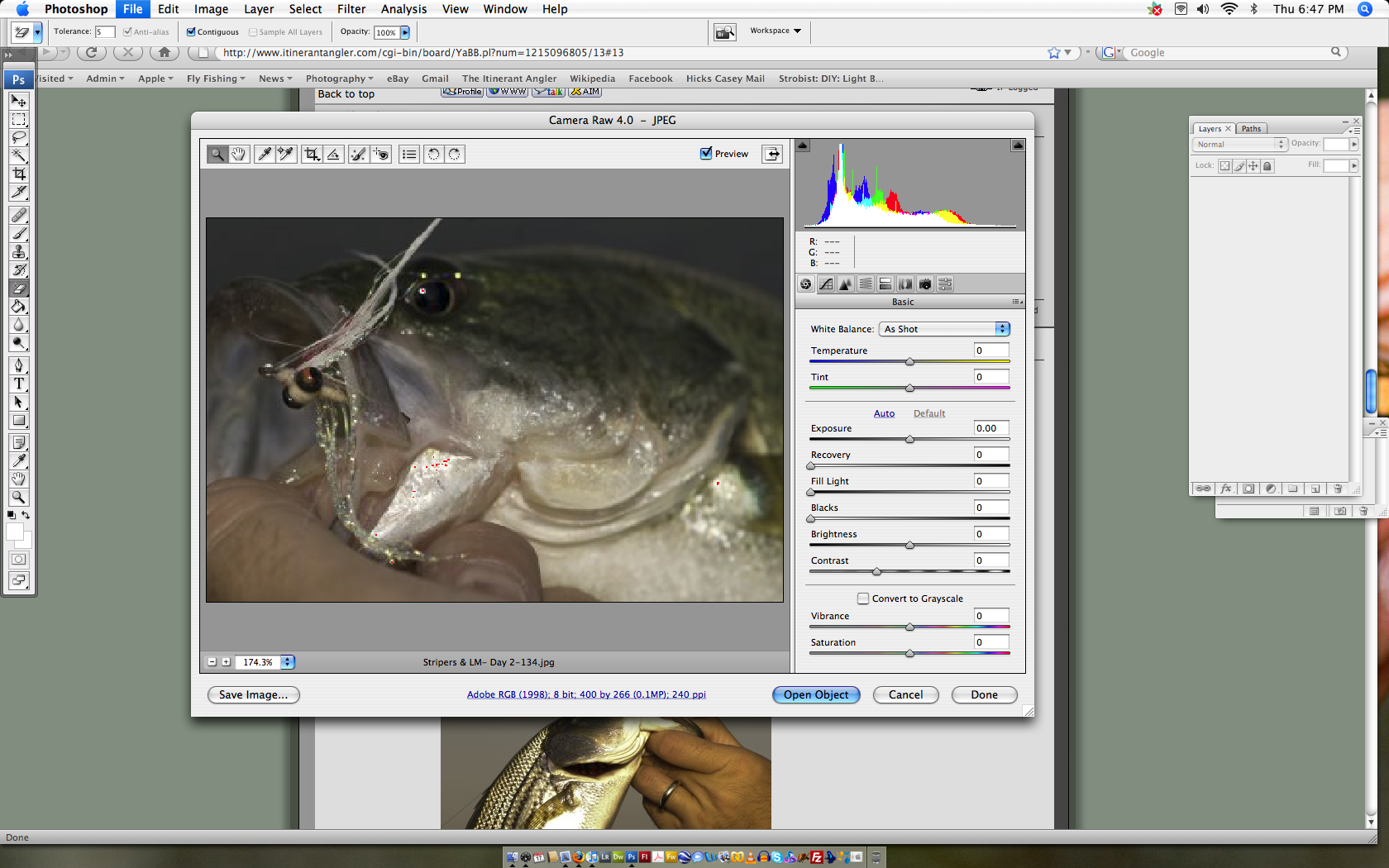
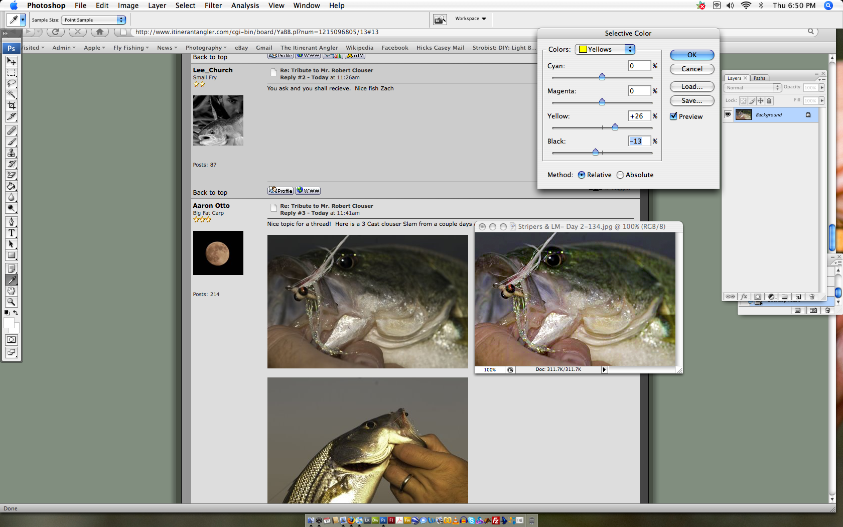
Here’s what I did (Click images for full screen shots):
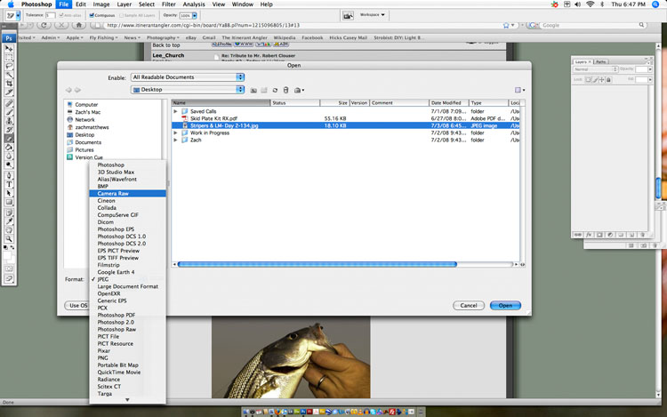
Open the image in Camera Raw using File/Open in Photoshop (here, CS3). This will give you RAW-style controls over JPEGs.
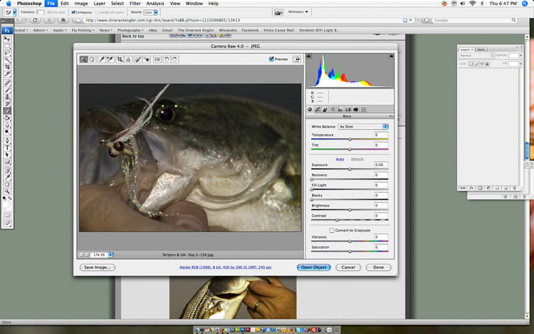
Adjust the sliders until they look right. I like to increase exposure, increase recovery, and increase blacks. That will push up the brights, then draw the tones of the brights back to gray so they don’t clip (with the recovery tool), then deepen the dark spots. The idea here is to move all of the colors further toward their primaries and further away from their central gray tones the camera tries to produce.
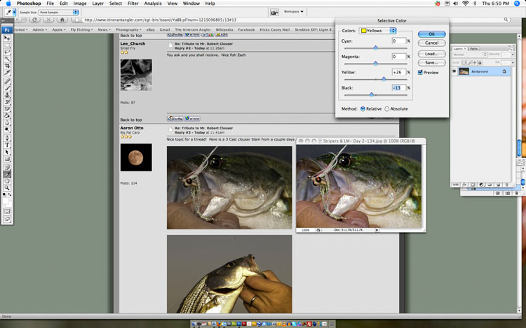
Once you have the image on the work space you can still do some stuff to it. I use Selective Color to darken the yellow tones while making them more yellow and to darken the reds while making them more orange (and less magenta).
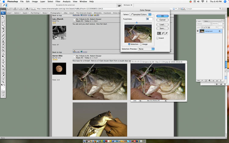
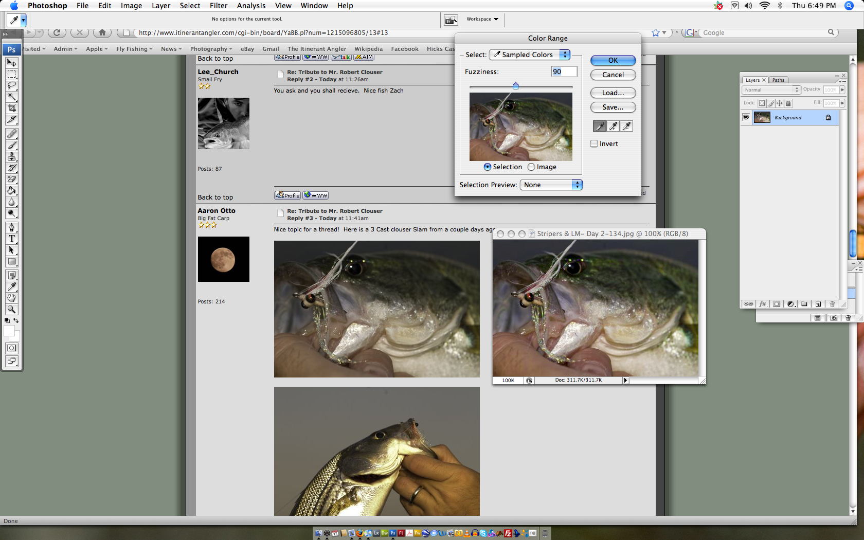
Finally, I grab the highlight sections using Select/Color Range with a medium fuzziness and use CTRL-C to copy them, then paste them back down as their own layer with CTRL-V. I then grab only the background and use the levels tool to push the brightness up and the darkness down, by moving the far left and far right sliders back toward the center. Having pasted the light sections on over the top as its own layer, I don’t have to worry about blowing out highlights. Lowlights are simply easier to preserve.
Finally, the noticeable JPEG artifacts are simply the result of working with such a small file size. With a full-res JPEG, I can hold them out or use Noise Ninja to take them down to an acceptable level.
Of course, all of this is simply clean up. The best way to make a good picture is to get the exposure right to begin with. Aaron’s image needed fill flash and should have been pushed up at least +0.7 in his exposure compensation.
Jul 4, 2008 at 2:01 am #63830Aaron Otto
MemberThanks Z- I truly appreciate you breaking it down for me.
Jul 4, 2008 at 5:24 am #63831krkaloz
MemberZach,
Maybe I have been living under a rock or sucking sand for too long but that is about the collest thing ever!!! Absolutly AWESOME!!! I have used PS usually to spice up or make fun of someone during intel briefs while deployed I had no idea it had that capability!!!!!
WOW!!!
Jul 4, 2008 at 9:47 am #63832 John BennettMember
Nice Zach.
One of the coolest things about PS and ACR in CS3 is that there are usually a few ways to skin the cat. I do most of my global adjustments in ACR, even curves now. In time, I’ll probably learn something new and for a time use that process until something new comes along agan
🙂The area I havent motivaed myself to learn yet are layers, layer masks and more advanced adjustments. One theres just soo much to learn potentially and two I dont know how wise it is. Meaning how publishable more “creative” images are.
Aaron, don’t get discouraged. There is an awful lot to lexplore and learn. I’ve been pushing myself hard sponging, learning everything I can and pushing just as hard to get out and get images of stuff on weekends, for a few years now and I still have a long ways to go.
(my wife calls it obsessing)
It comes with time. Compare images you take this week or next to images you took this time last year.
Jul 4, 2008 at 1:45 pm #63833MemberAnother thing I thought about after re-reading this is, I’m usin Ps2 and Lightroom.
Jul 4, 2008 at 7:32 pm #63834The Itinerant AnglerHey Aaron –
Just keep plugging away.
Jul 5, 2008 at 12:50 pm #63835kevin powell
MemberHey Aaron –
Just keep plugging away.
Jul 5, 2008 at 3:38 pm #63836lee church
MemberThanks Zach, much appreciated.
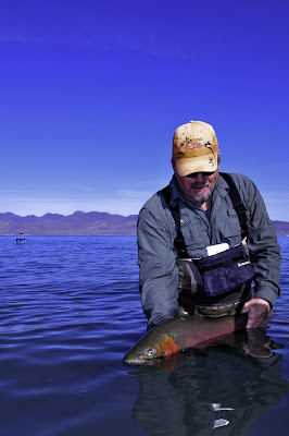
Jul 6, 2008 at 2:32 pm #63837MemberSo instead of fishing this weekend I decided to work on this; Here is the three I’ve tried so far. Having to use a hybrid of both LR and PS2. Not there yet; but getting closer…
Before:
After:
Before:
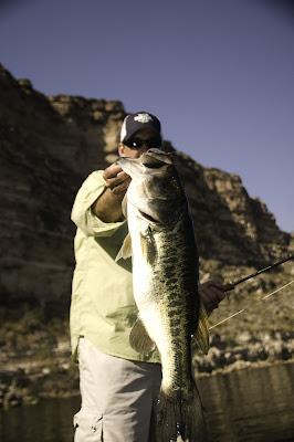
After:
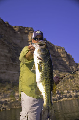
Before:
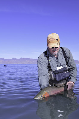
After:
 Jul 6, 2008 at 3:34 pm #63838Member
Aaron… you are on it. Looks great – just watch the saturation and you are good.
When I get back to work I was going to get the complimentary tutorial for CS2 – which will show everyone the real flexibility of CS3. I want to sit behind CS2 to make sure it is correct.
Jul 6, 2008 at 3:49 pm #63839MemberThanks Kevin. I will keep working on it . Here’s another one;
Before:
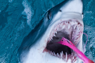
After:
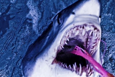 Jul 6, 2008 at 4:14 pm #63840Member
Still not liking the colors; Feels a bit off to me and I’m not sure why. Any thoughts anyone?
Before:
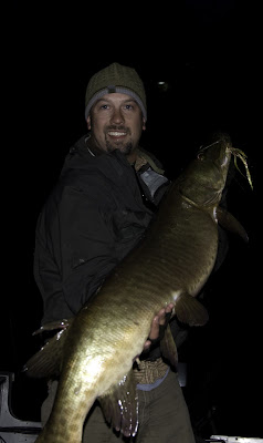
After:
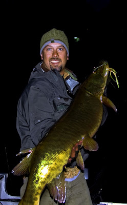 Jul 6, 2008 at 4:28 pm #63841Member
My shot at the origional example, still a little dark..
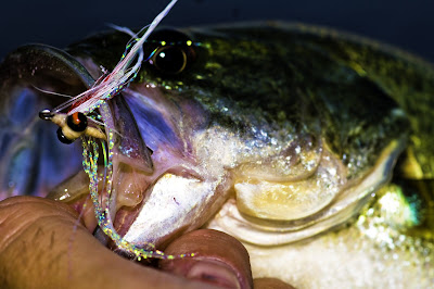 Jul 7, 2008 at 2:20 am #63842Member
Still not liking the colors; Feels a bit off to me and I’m not sure why. Any thoughts anyone?
Before:
After:
Just back off on the saturation a little.
When you crank in those colors it tends to get a little saturated and to reduce the saturation a little gives it back it’s natural feel.
Jul 7, 2008 at 2:50 am #63843MemberThanks Kevin. Will hold on the saturation slider for a bit. I apprecaite your help!
AJul 7, 2008 at 11:43 am #63844The Itinerant AnglerYou’re over-doing it by a little bit, but you’re learning some important stuff.
First, don’t use the Saturation slider at all. It’s a blunt instrument. Saturate individual colors if you have to, but I prefer using the Selective Color tool to darken or increase color.
Second, watch your magentas. Your monitor may not be showing you the same tones as other see; that’s a constant problem with photo editing.
Finally, remember that not every image needs to look like it’s in Technicolor. The image that looks best in the above is this one:
You’re still a little hot on the magenta tones but this one is getting there. But, I would point out that this was the best exposure to begin with too; the better the material is to start, the less you have to do in Photoshop and the better it will wind up looking.
Zach
Jul 7, 2008 at 11:54 am #63845The Itinerant AnglerHere’s a link to my most recent streamside photography lecture.
Jul 7, 2008 at 1:44 pm #63846Rich Kovars
MemberSorry about the downer stuff above, just got four rejection notices yesterday right before I opened the thread up. Was a bit gloom.
Take every one of them and learn from it.
Jul 7, 2008 at 2:35 pm #63847MemberA little more difficult in CS2.
Open the Jpeg file.
1. Make a duplicate of the background layer (important to keep your original pixels)
2. Adjust the exposure (image>> adjustments>> Exposure)
play with those sliders until it feels right3. Next… (image>> match color>>) On this one I just cranked up the color intensity to 200 and left everything else. I like the color right here but you tend to loose a little of the white detail so let’s try to regain some of that
4. So next… (image>> adjustments>> Shadow/Highlight>>) Click on the show more options box. I work from bottom to top in here. I do not understand the defaults in here but I am working from the default settings.
first I bumped up the the midtone contrast to try to regain those details. Then I bumped up the “amount” of highlights about then I backed off on the “Amount” of the shadows.This got it to the point where it matched Zack’s
5. The color was a little intense for me personally so I backed off the saturation a little. (image>> adjustments>> hue/saturation (command U) ) just back off on the saturation a little.
OR
a simplified and quick “To See What You have” version.
1. Open image, duplicate layer.
2. adjust exposure
3. Adjust the shadows and highlightsJul 7, 2008 at 9:52 pm #63848MemberThanks Rich, Zach and Kevin. I’ve printed all of yoru comments and will review the lecture Z.
-
AuthorPosts
- You must be logged in to reply to this topic.