


New Montana Troutaholic shirt design
Blog › Forums › Fly Fishing › New Montana Troutaholic shirt design
- This topic has 17 replies, 12 voices, and was last updated Mar 12, 2009 at 3:53 pm by
Corey Kruitbosch.
-
AuthorPosts
-
Mar 6, 2009 at 2:32 am #3909
 Joel ThompsonMember
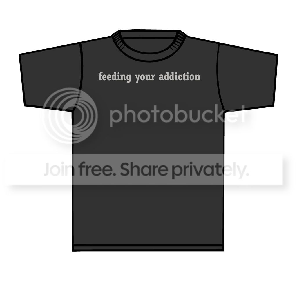
HI All!
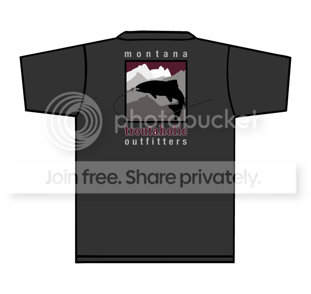
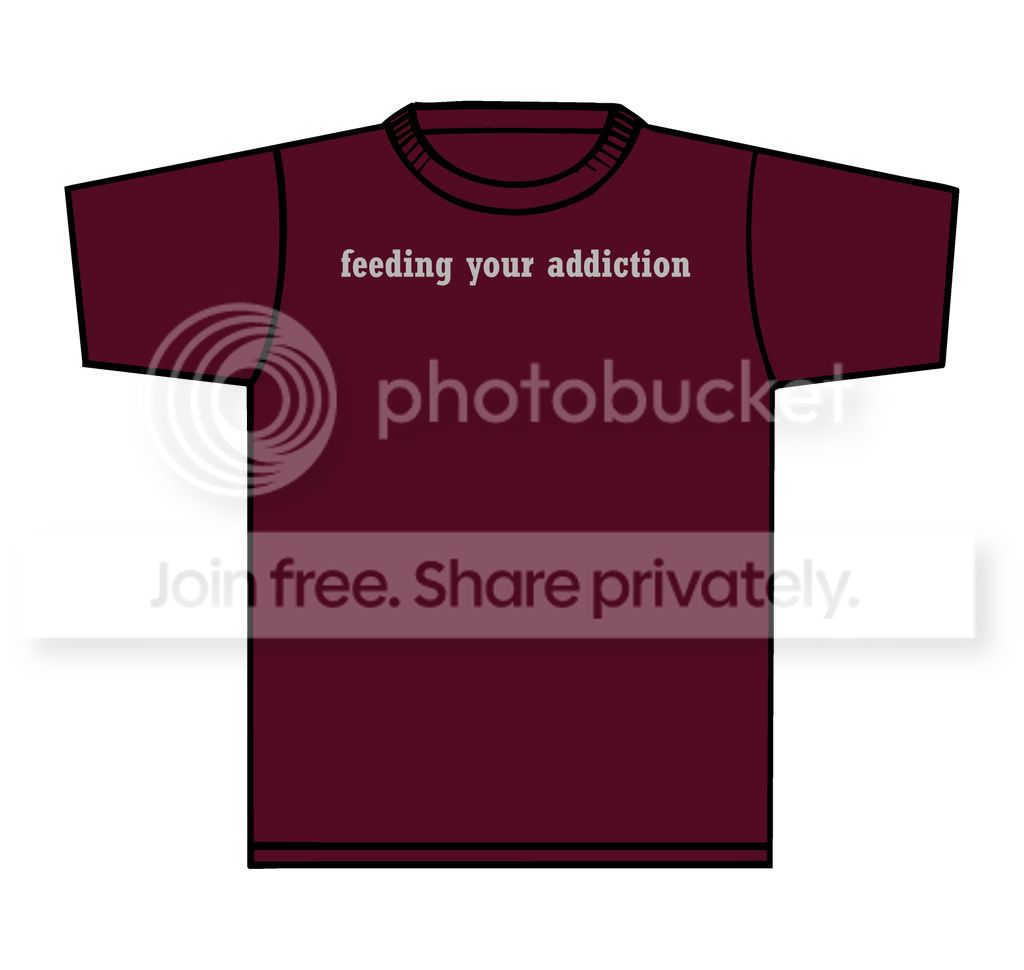
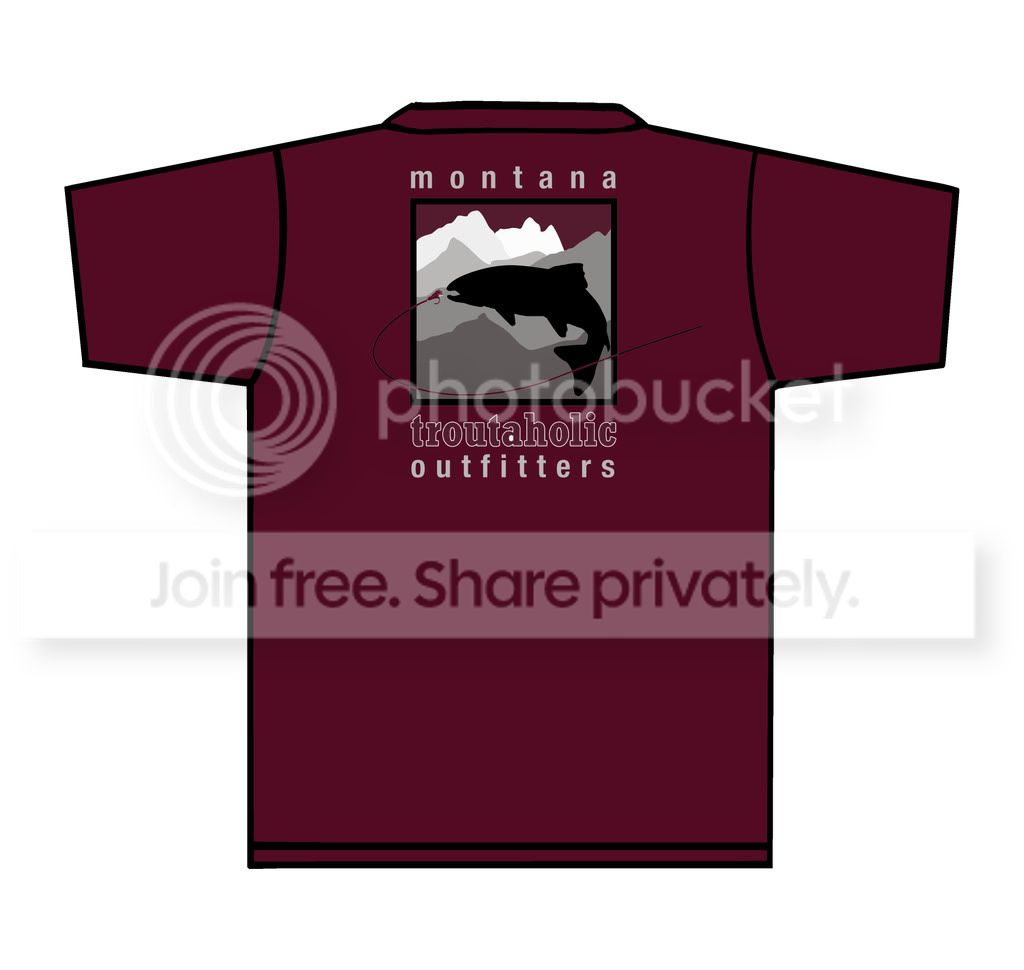
I am working on a tee shirt design with Rick Marcum from the board here and this is what we have come up with. I would love to hear your opinions before I have them printed up!
Thanks in advance!
Joel
 Mar 6, 2009 at 2:39 am #34141
anonymous
MemberJoel,
I’ll need
Mar 6, 2009 at 6:06 am #34142cole m.
MemberI like them! Where can I buy!
Mar 6, 2009 at 10:00 am #34143 Tim AngeliMember
I think both graphics should be moved down slightly on the shirt. That’s just constructive criticism and that being said, I really like both colors and would purchase one of both.
-Tim
Mar 6, 2009 at 11:57 am #34144 David AndersonMember
I like the design, but think it would look better with the large graphic on the back and a smaller version of the same under the ‘feeding your addiction’ on the front.
Do people around you read the front and back of your short at the same time ?
www.dsaphoto.com
A picture is thousand words that takes less than a second while a thousand words is a picture that takes a month.
Mar 6, 2009 at 12:51 pm #34145Joel ThompsonMemberThanks for the input so far guys!
Cole you will be able to buy them soon over at my website which is http://www.montanatroutaholics.com
Probably going to order 50 shirts this weekend so keep the advice coming!
Joel
Mar 6, 2009 at 2:45 pm #34146 Bob RigginsMember
I love the back.
Mar 6, 2009 at 3:35 pm #34147 Ryan RileyMember
Like em both!
Mar 6, 2009 at 9:02 pm #34148john michael white
MemberI’m a sucker for Sage/Olive Green for Tshirt color….any chance of getting them in this color?
Mar 6, 2009 at 9:57 pm #34149lee church
MemberI’ll take a black one and a full days float down the river of your choice in June…lets make a deal. 🙂
Shirts look great so does the site, as I’ve said before!
LC
Mar 6, 2009 at 10:53 pm #34150 Mark SchaferMember
I like the gray, I’ll need one for both boys again. The beanies are a big hit here but my daughter thinks there should be one with a ponytail slot… just and idea.
MS
Mar 7, 2009 at 5:05 pm #34151Joel ThompsonMemberMy thought with putting my slogan on the front was to make people go huh and turn around for a double take and then see the back of the shirt. May or may not be nessecary…I just really like my slogan. 😉
Do you think the slogan should be removed from the front? Would it prevent you from buying a shirt like this or would it make you WANT to buy it?
I need to make a decision soon I respect all of your input!
Thanks!
Joel
Mar 7, 2009 at 11:40 pm #34152 Eric WellerMember
Joel,
Mar 8, 2009 at 2:07 am #34153Bob RigginsMemberThe front makes more sense after you explained it.
Mar 8, 2009 at 7:42 pm #34154Tim AngeliMemberDo you think the slogan should be removed from the front?
I think the slogan should stay.
Mar 8, 2009 at 11:54 pm #34155MemberKeep it!
Mar 10, 2009 at 2:44 am #34156Joel ThompsonMemberCole I will be keeping the slogan. I am also going to add the fish and fly line from my logo in a small version to go right underneath the slogan just to tie things in. I should have a sample shirt to show everyone before I head to New Zealand at the end of the month. When I return I will be taking orders.
Mar 12, 2009 at 3:53 pm #34157MemberThey look great! I’ll be in for one!
-
AuthorPosts
- You must be logged in to reply to this topic.